
As with most branding projects, the logo was the starting point. A mark was needed for the program that had a strong visual link with the existing LastPass logo. It also needed to successfully accommodate the three variants/tiers of partnership (Silver, Gold and Platinum)
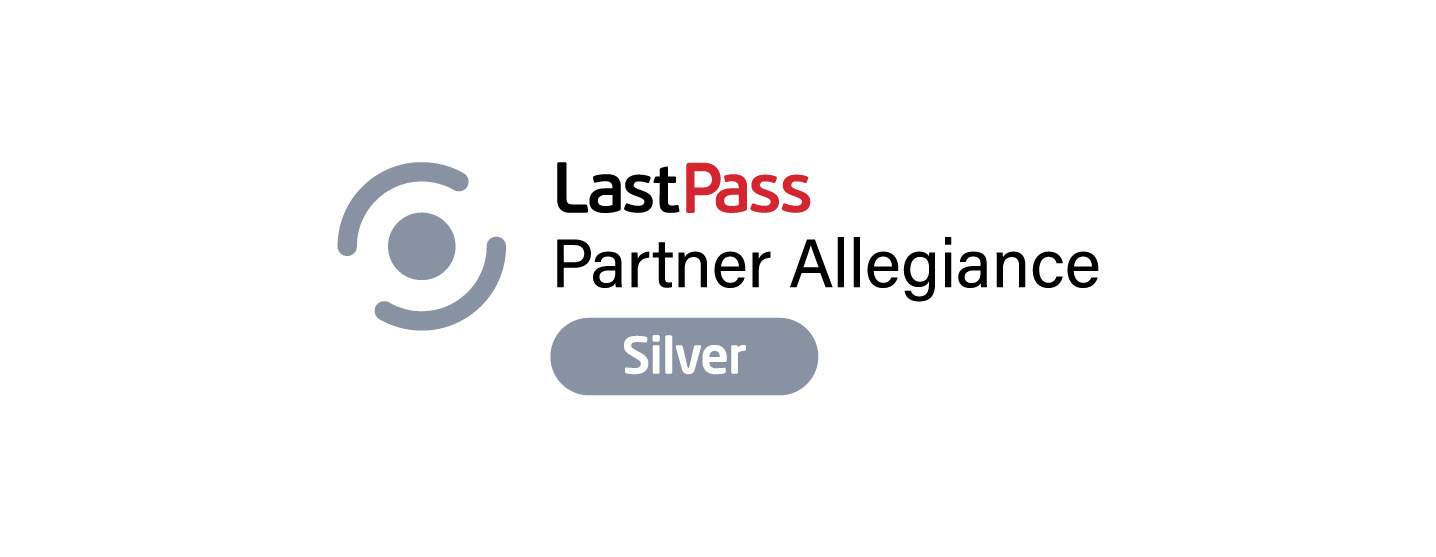
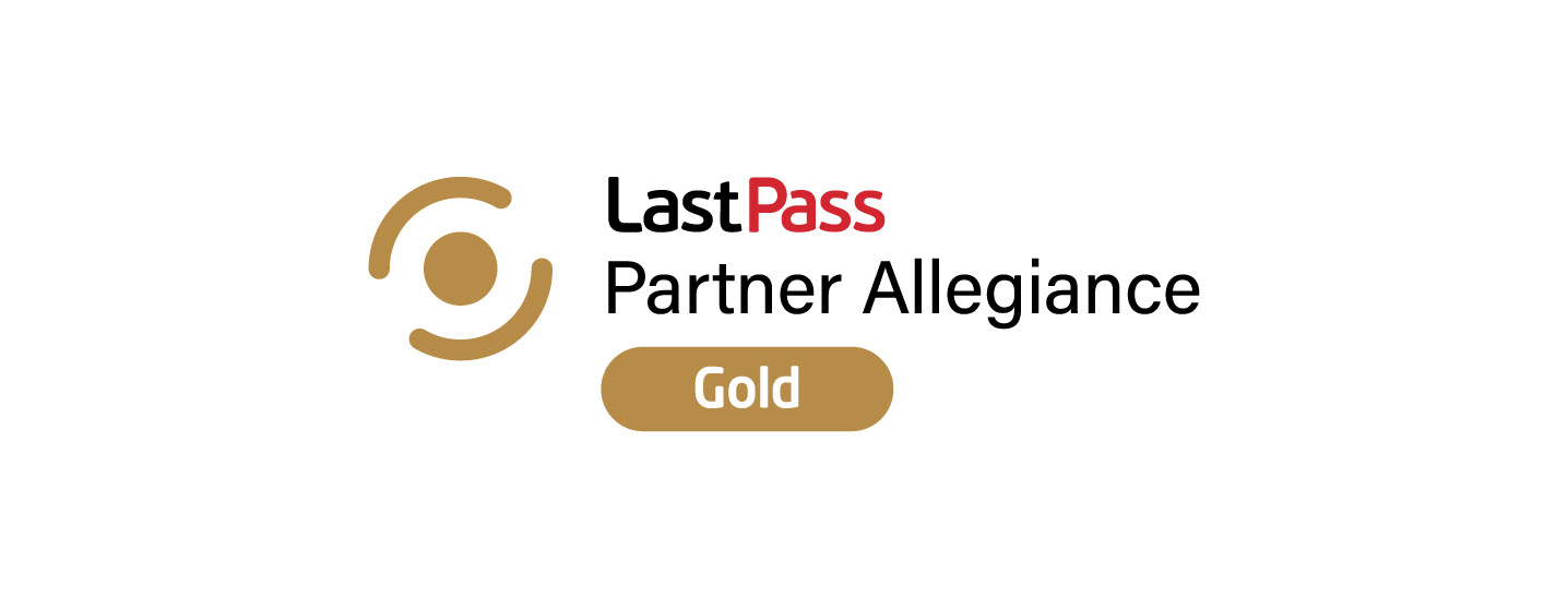
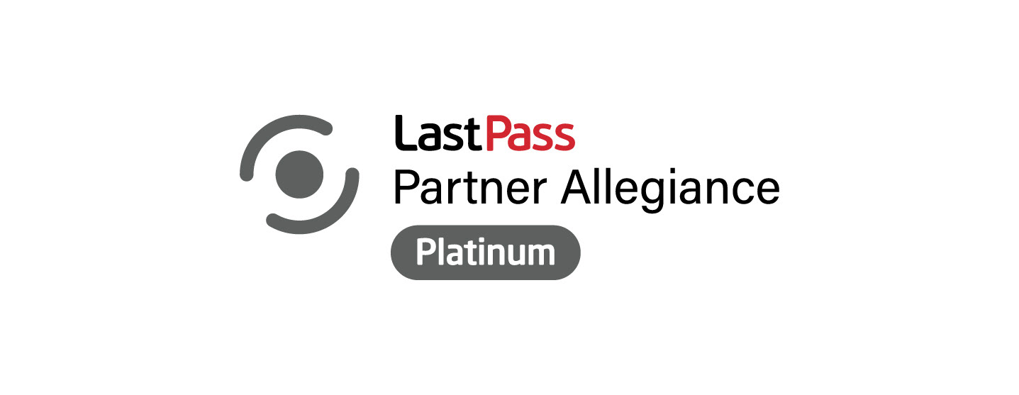
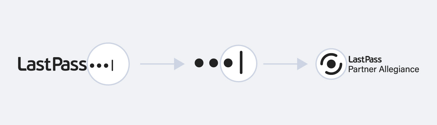
The construction of the logo is derived from the LastPass logo.
The 'dot and line' sizing relationship remains true. The difference being that the line is curved and repeated.
The 'dot and line' sizing relationship remains true. The difference being that the line is curved and repeated.
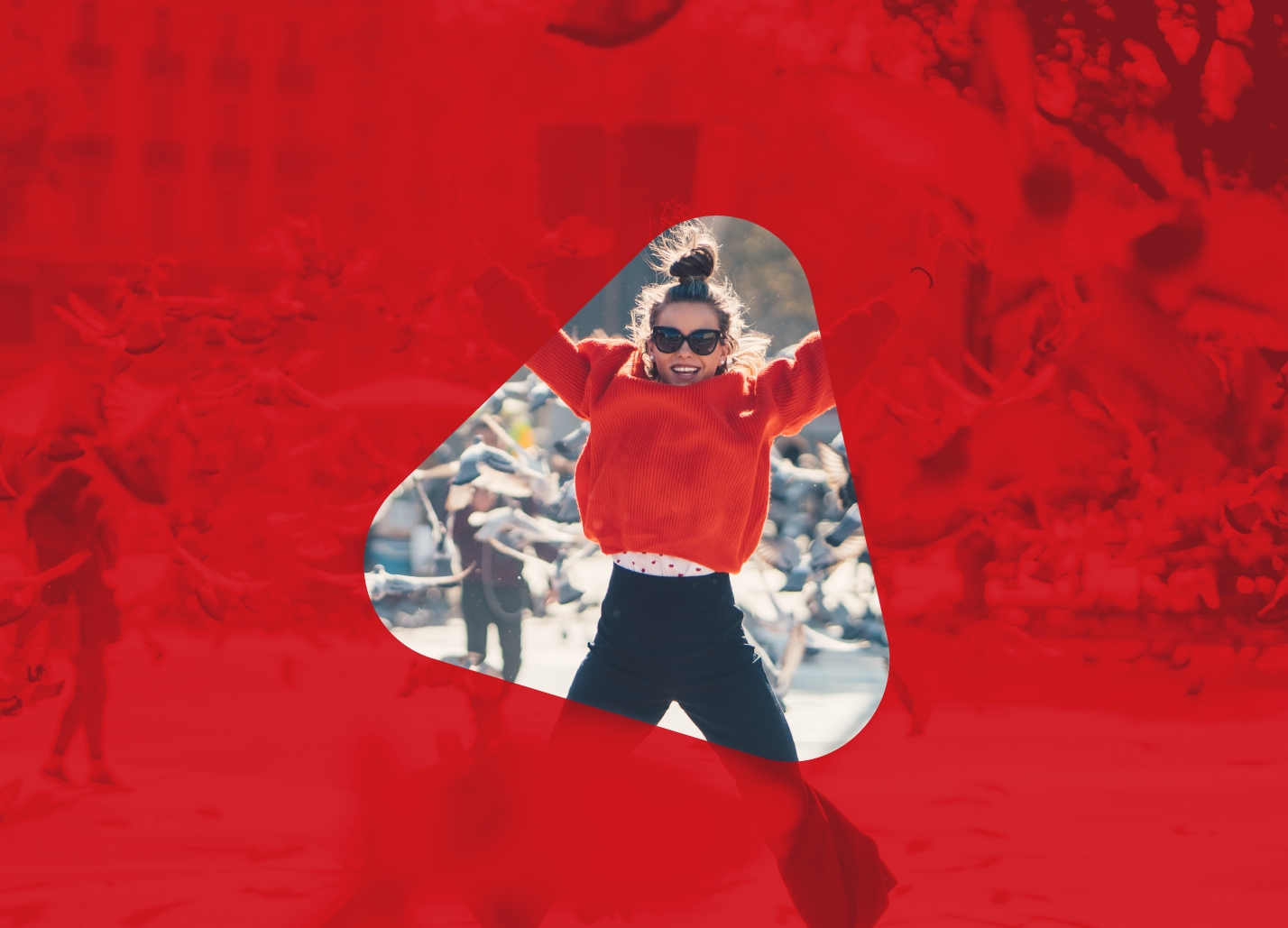
The triangular holding shape treatment for a full-bleed red background
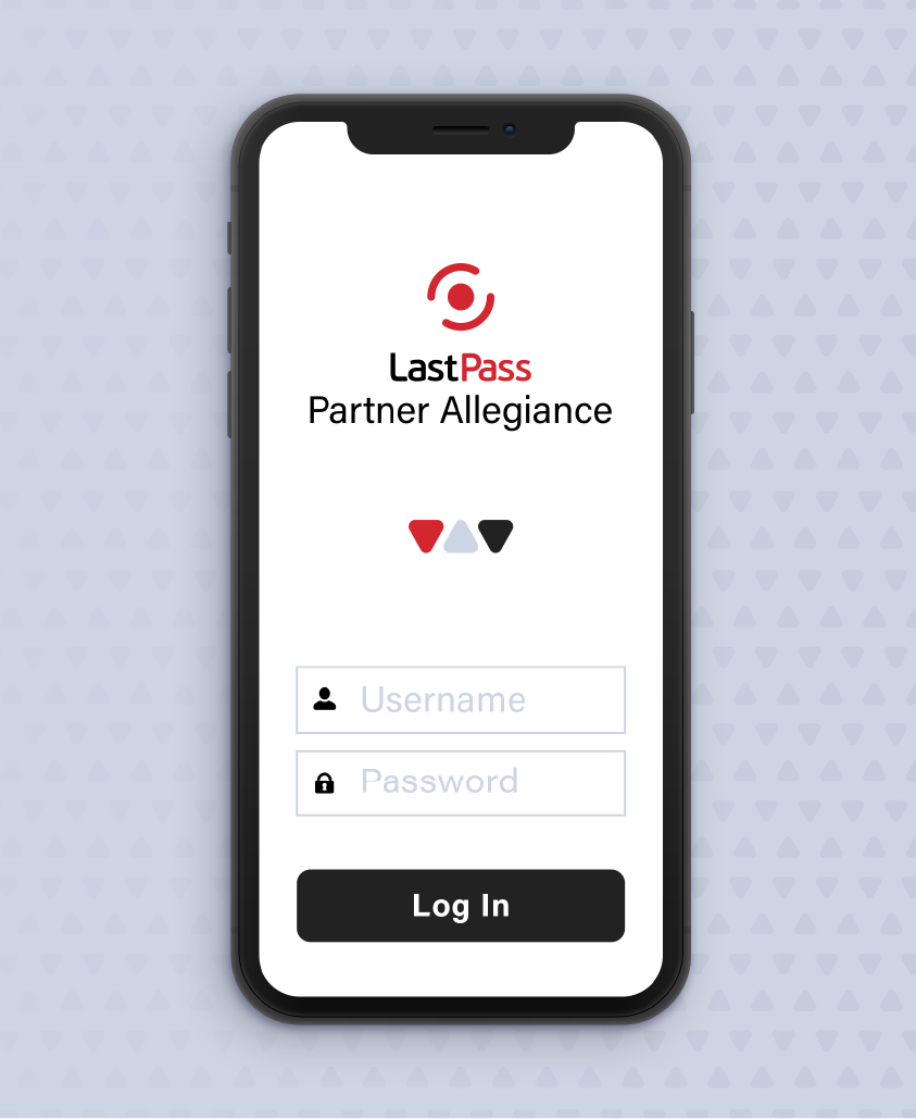
The stacked logo used when appropriate
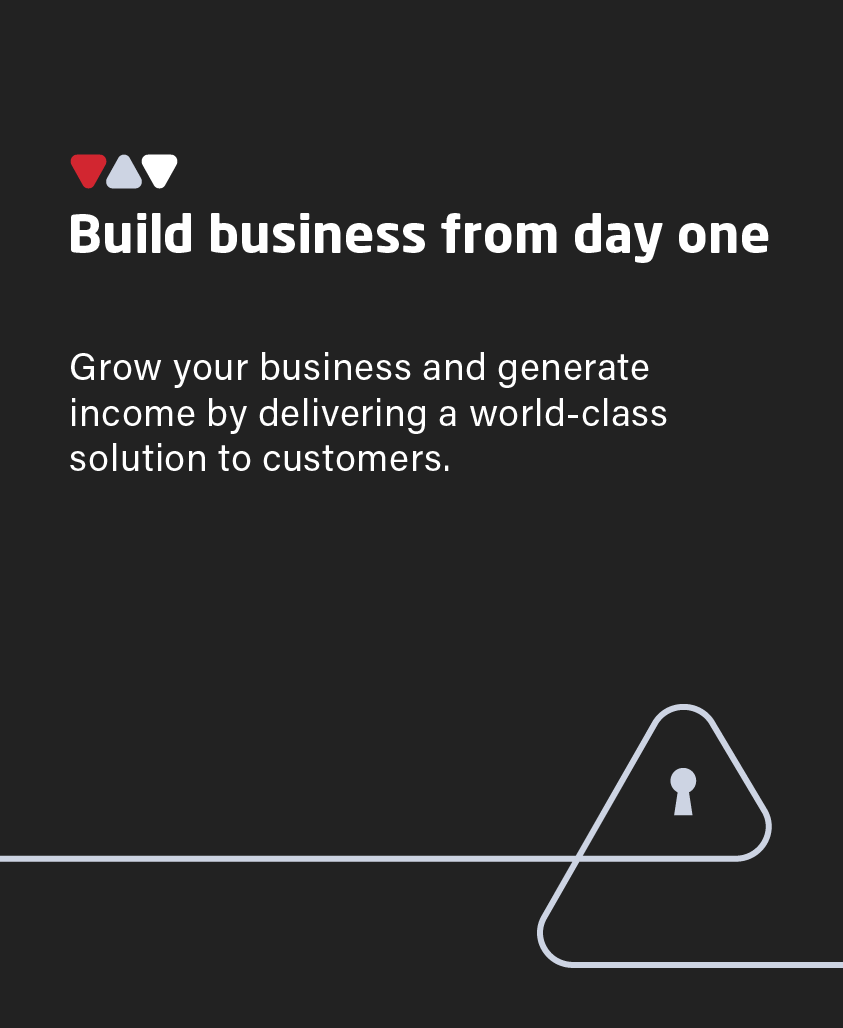
The three-dot triangle lock used as a heading eyebrow

Free-standing imagery contained in the triangular holding shape
To create the continuity between the program branding and the LastPass brand, some graphic elements were brought across. However, the usage differs slightly in order to create a distinct look & feel.
Specifically, the colour palette changes and the rules surrounding the usage of the triangle shape differentiate the program.

Holding shape (derived from logo) and icon style

There is a departure from using grey – instead the dull grey has been replaced by a more interesting light stone-blue. There is also a tint and hue of this colour that has been added to the palette and used extensively to provide a contrast to the strong red colour.
This long-scroll PDF shown to the right, shows how the various graphic elements are applied.
It is worth noting that the secondary colour palette is restricted to usage in diagrams.
Long-scroll PDF
Spreads from the brand guidelines document