
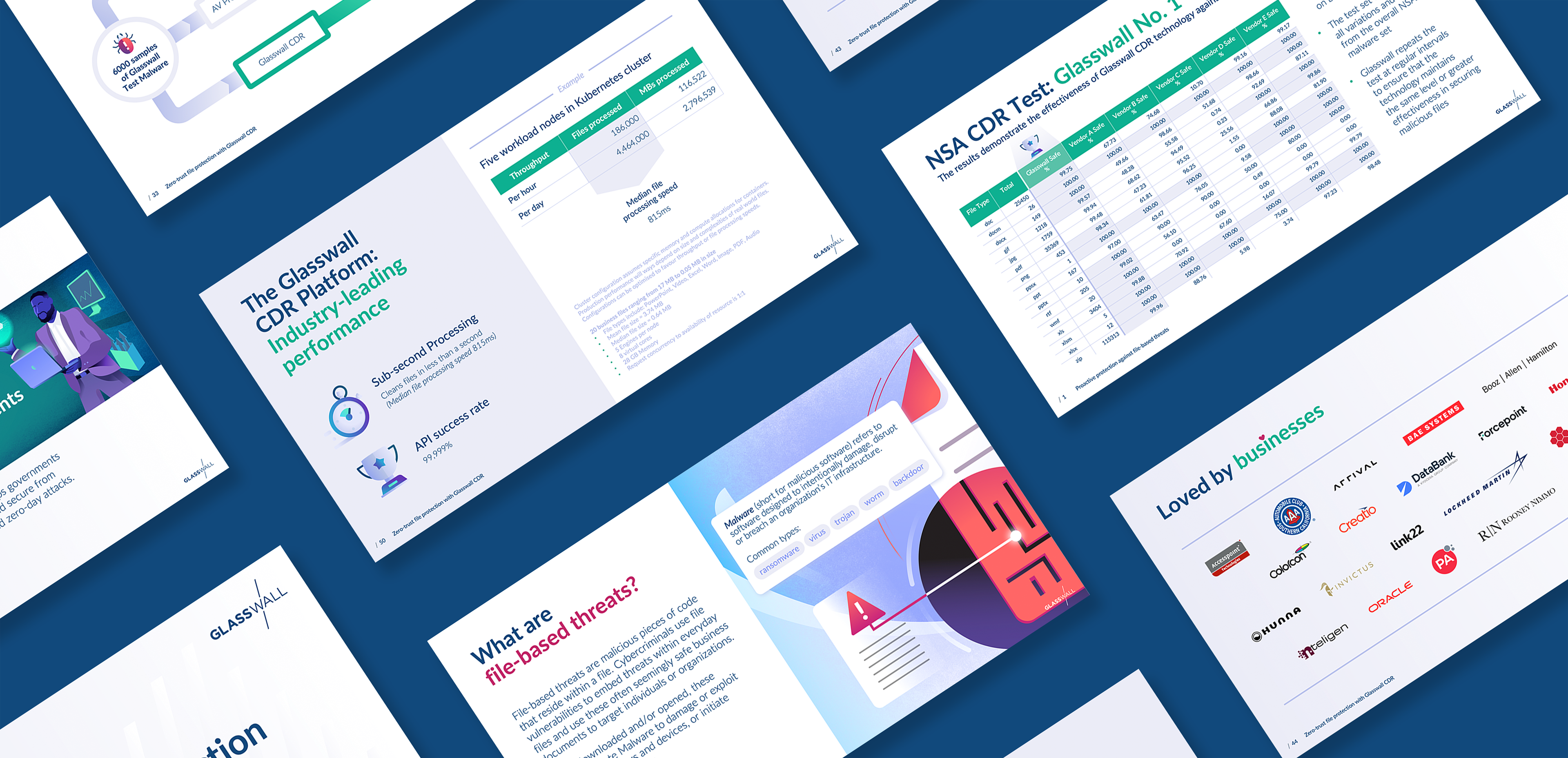
Glasswall underwent a re-brand, and needed to have their sales decks and PowerPoint templates aligned. I worked closely with their in-house design and marketing team to craft this deck.
Below are a select few slides showing the old content (on the left), and the end-result of the re-design (on the right).

Before

After
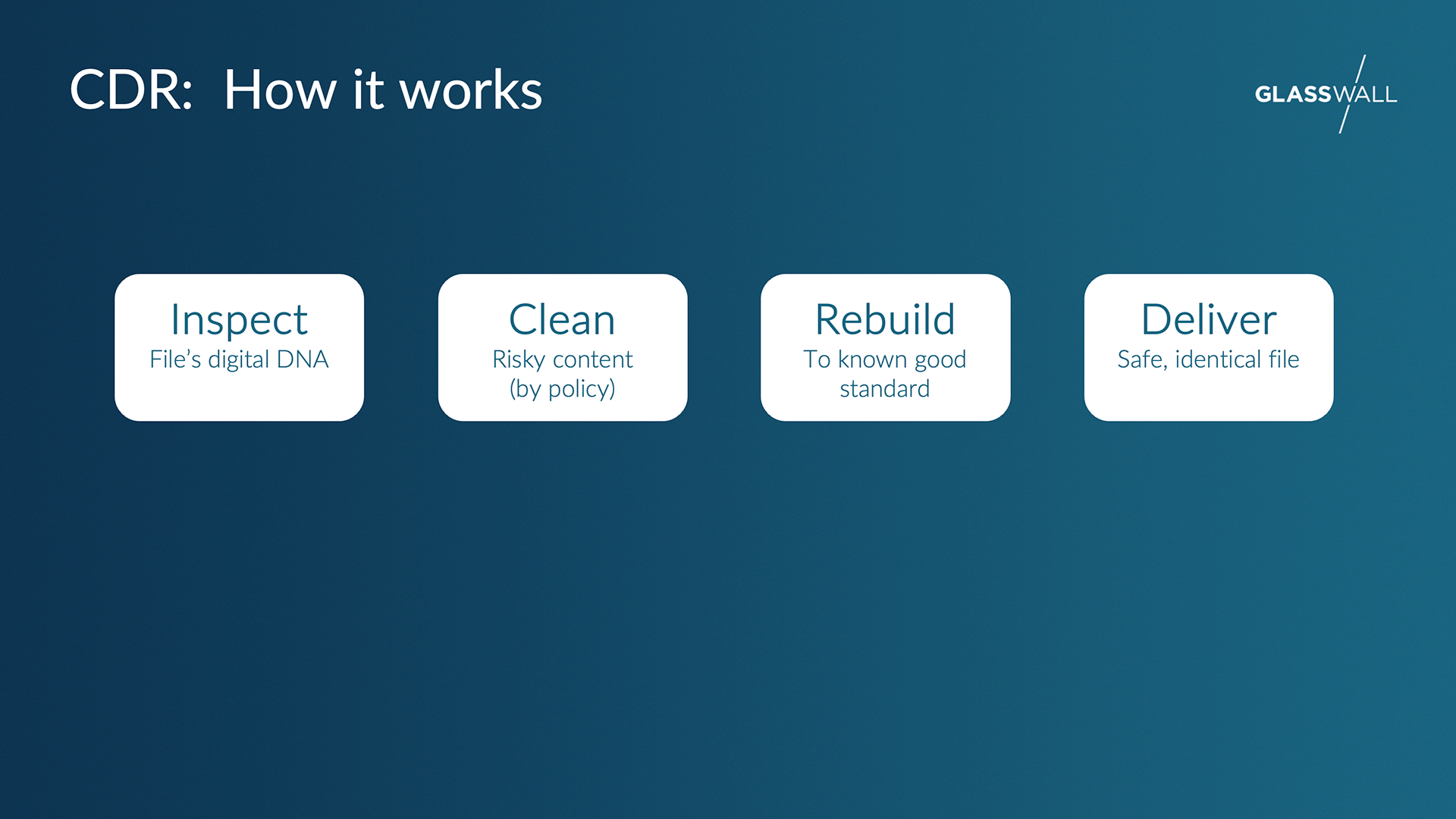
Before
After
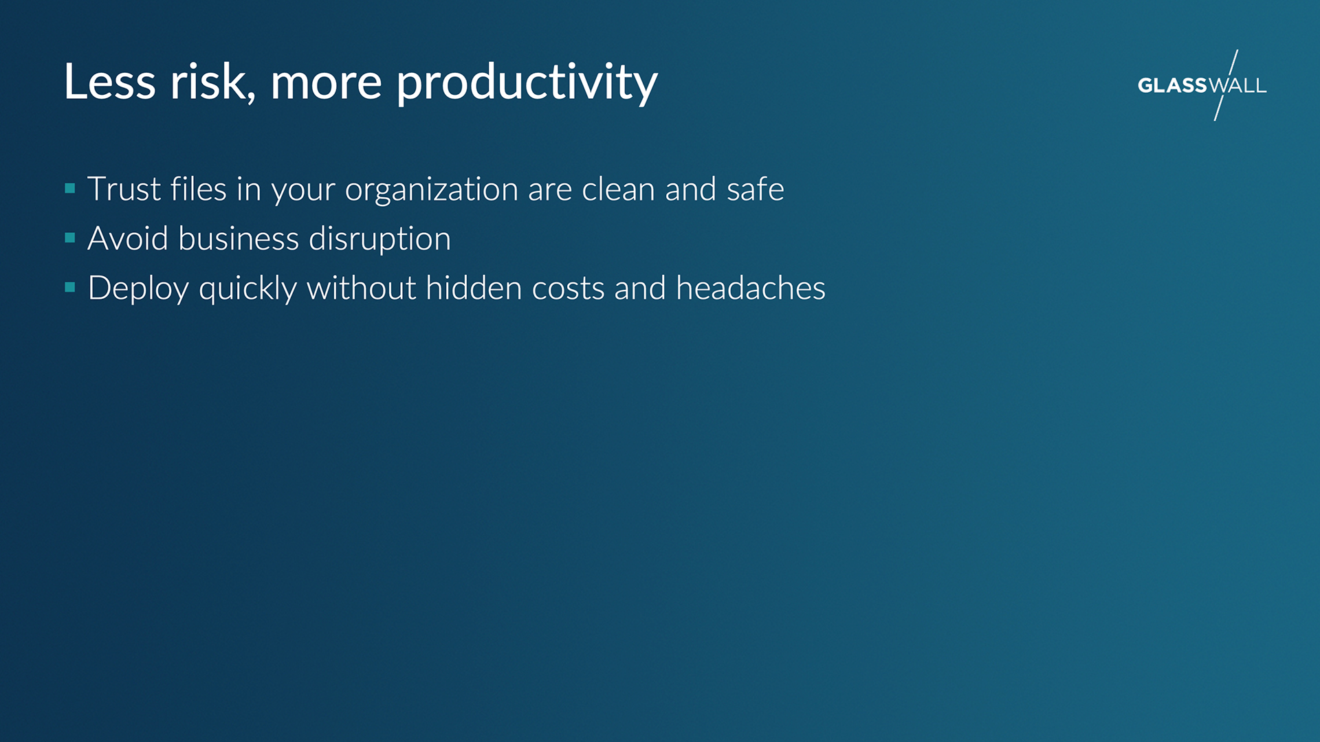
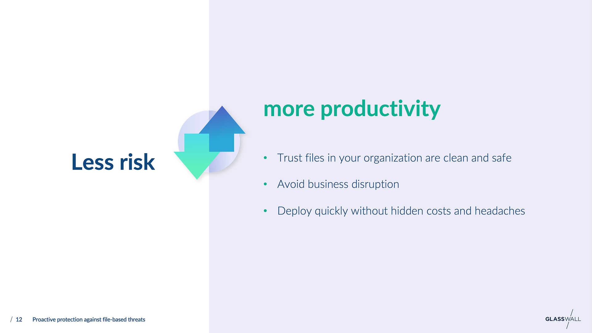
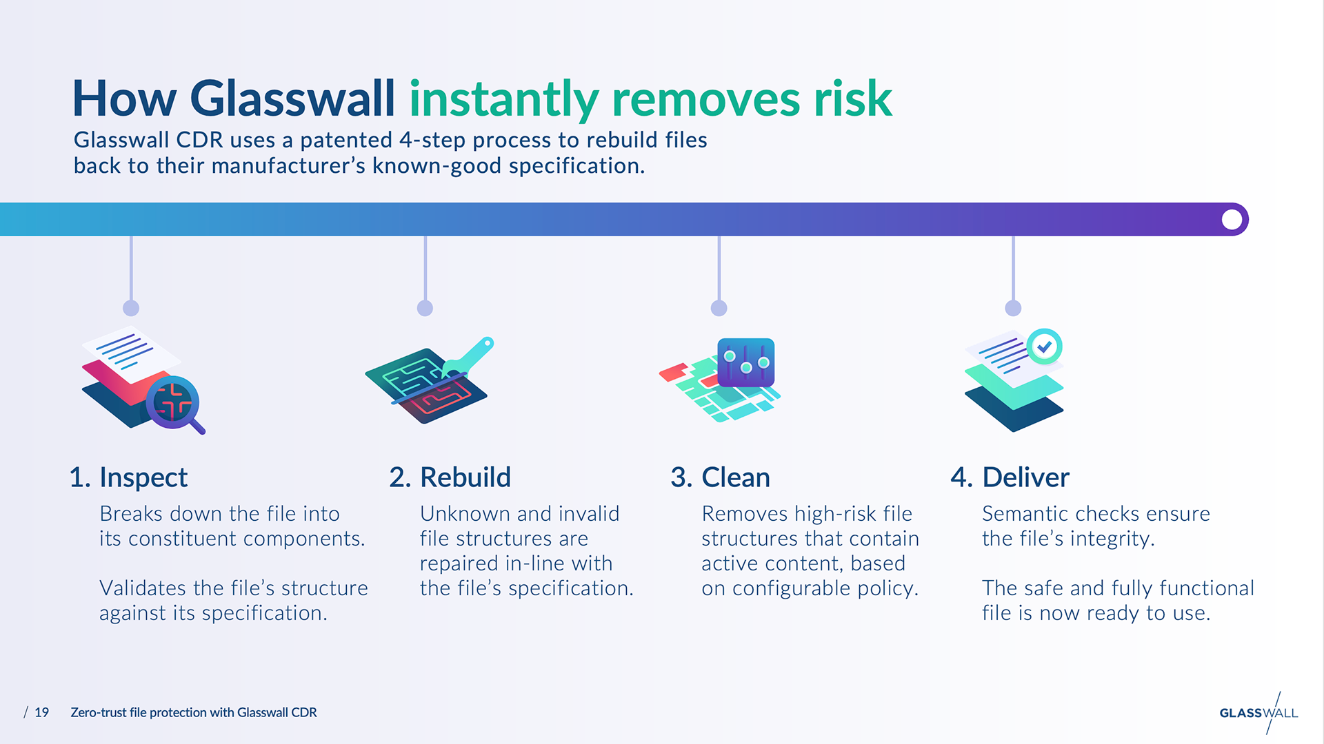
Before
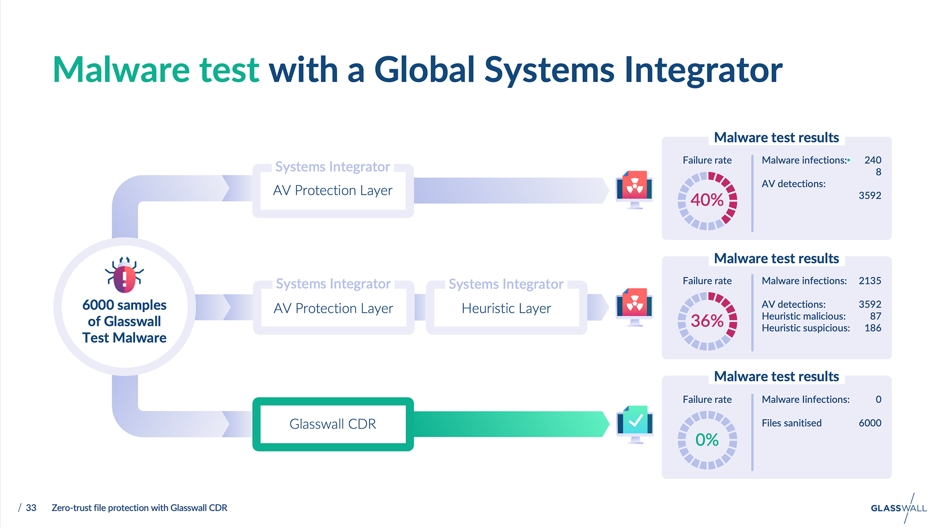
After
We decided to steer away from the dominance of the very dark teal colour – which made them feel very traditional (even though this was still included within their colour palette).
Consequently, I used a lot of the light blue/grey colour in the layouts, giving a fresh, light feel to the slides. It worked particularly well as a background colour to add structure to the layouts. This reliance on the neutral blue/grey was well received by Glasswall and set the stage for usage in other applications – such as case studies and on the website.
Before
After
The above video (screen capture) shows an example of how animation was used to build certain slides, aiming to maximise communication. This particular section of slides is key to Glasswall, as it describes the basis of their product offering.