
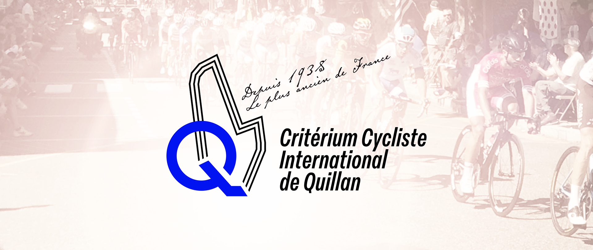

The translucent yellow and bright blue colours chosen for the identity reflect the colours of AS Quillan – the local association who hosts the event.
The restrained palette of three colours (yellow, blue and black) creates a strong presence for the event, making it easily recognisable each year

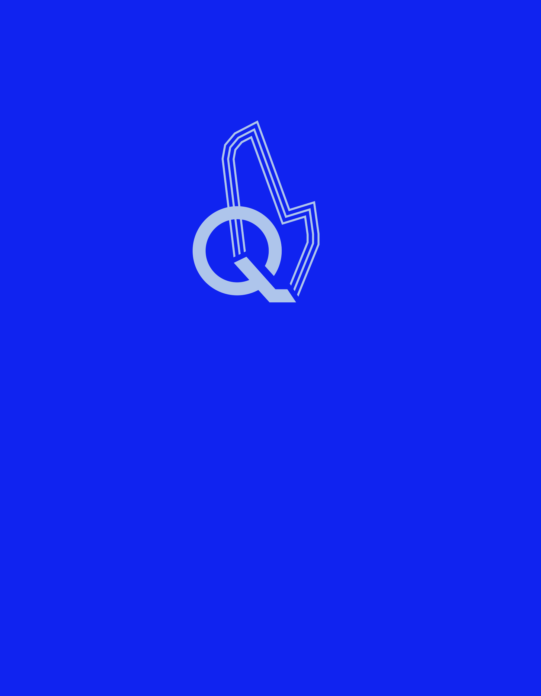
The logo is constructed by using the bold letter Q (for 'Quillan'), and the shape of the cycle route, making the mark distinctly unique.
The route – which has remained unchanged since 1971 – forms a distinctive shape that weaves into the Q. Artistic license was used to create more pleasing angles in some cases, but the overall shape remains intact. The repetitive lines express the laps (75 in total) that the cyclists ride.
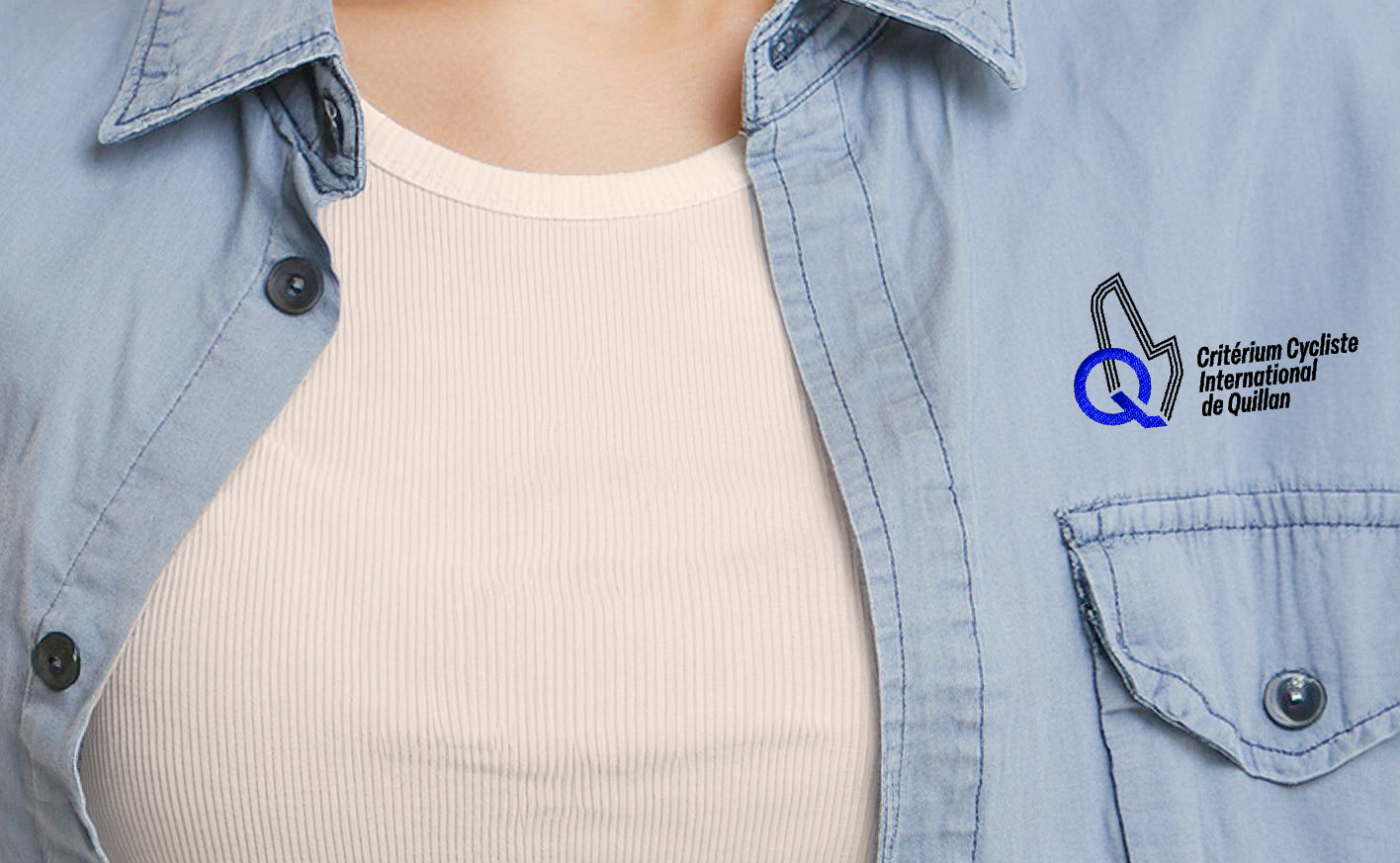
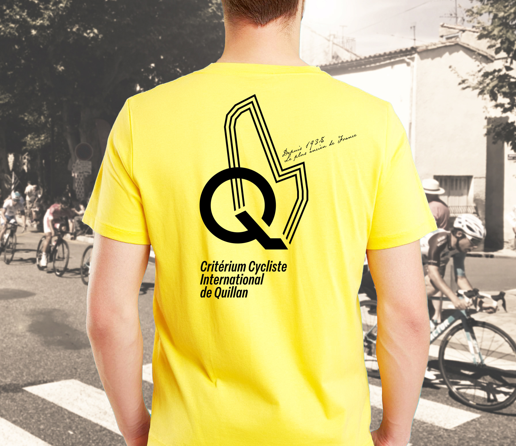
The blue collared shirts with an embroidered logo have been designed for the officials and committee members. Whilst the highly visible yellow T-shirts are for the many volunteers.
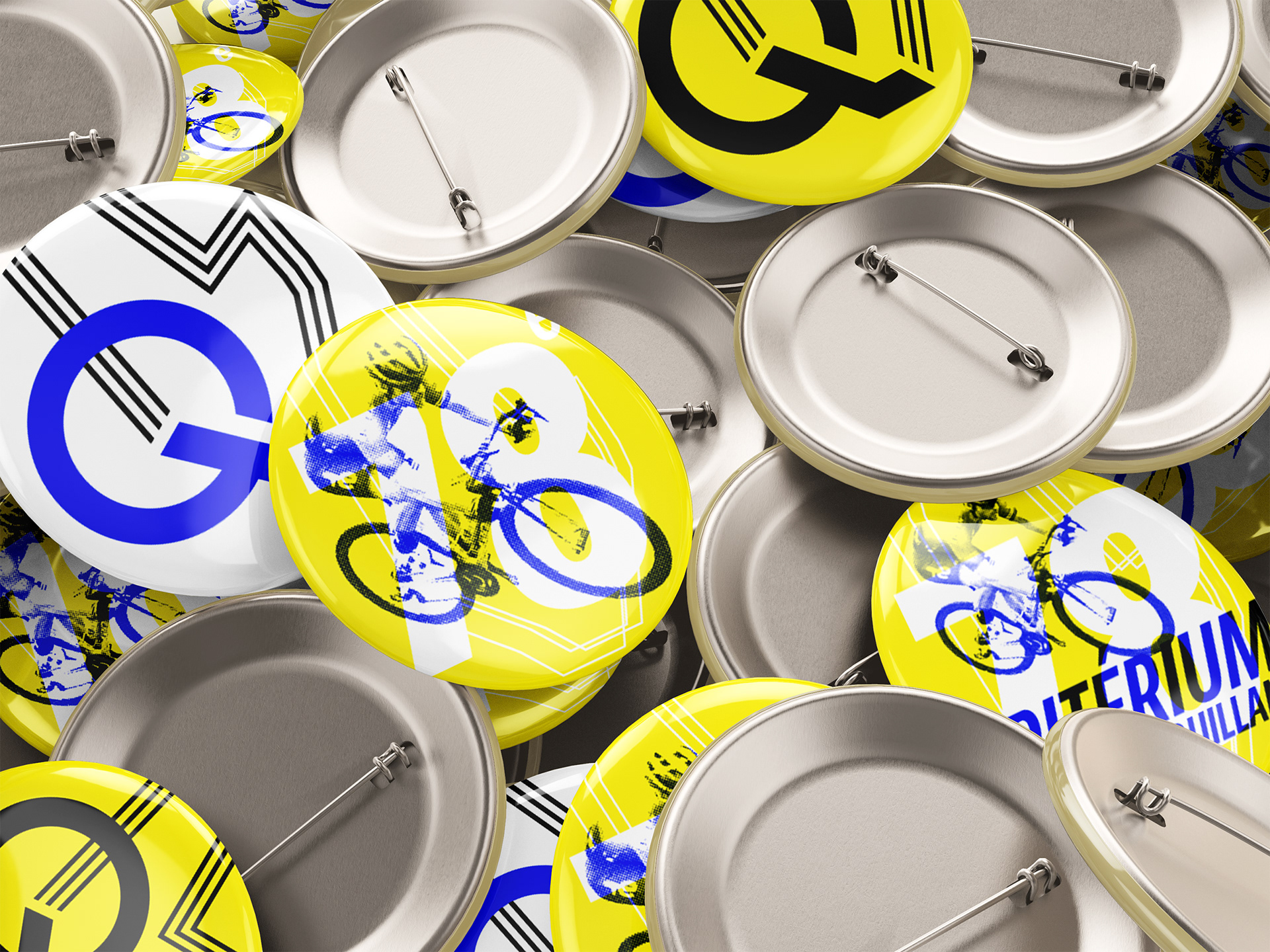
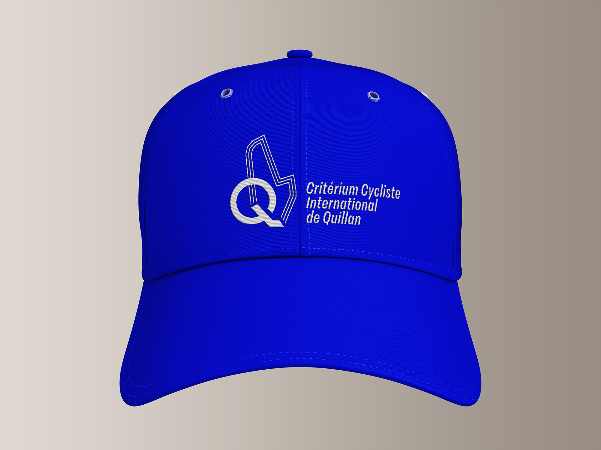
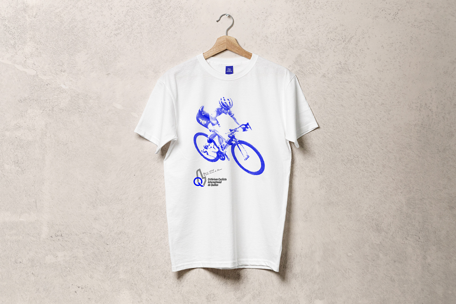
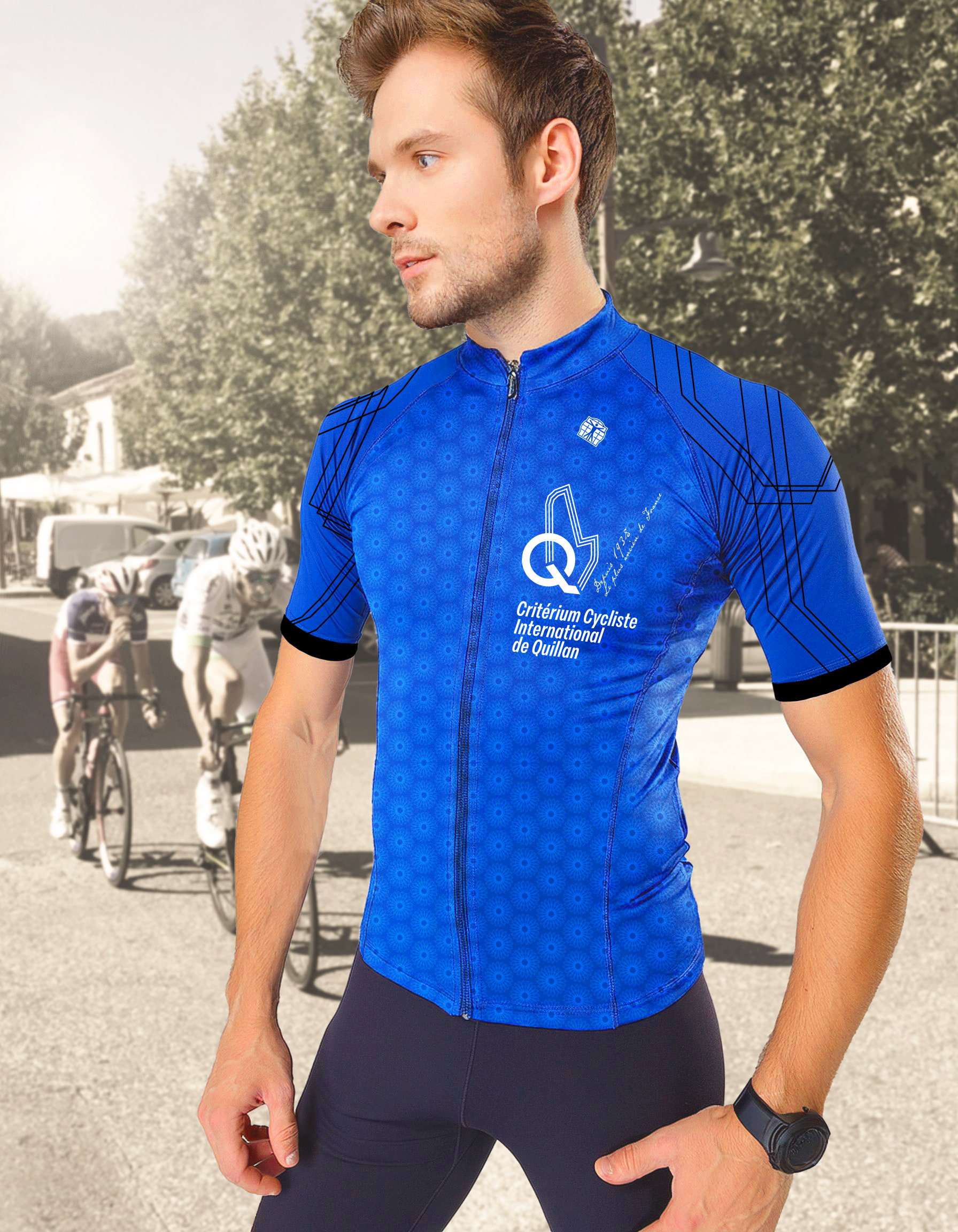
Branded merchandise include pins, T-shirts, caps and a collectors cycling jersey.
The cycling jersey graphics are made up of a repeat-patterned circular rosetta, constructed from the route portion of the logo. The thin route lines which are evident throughout the identity, are used on the sleeves.

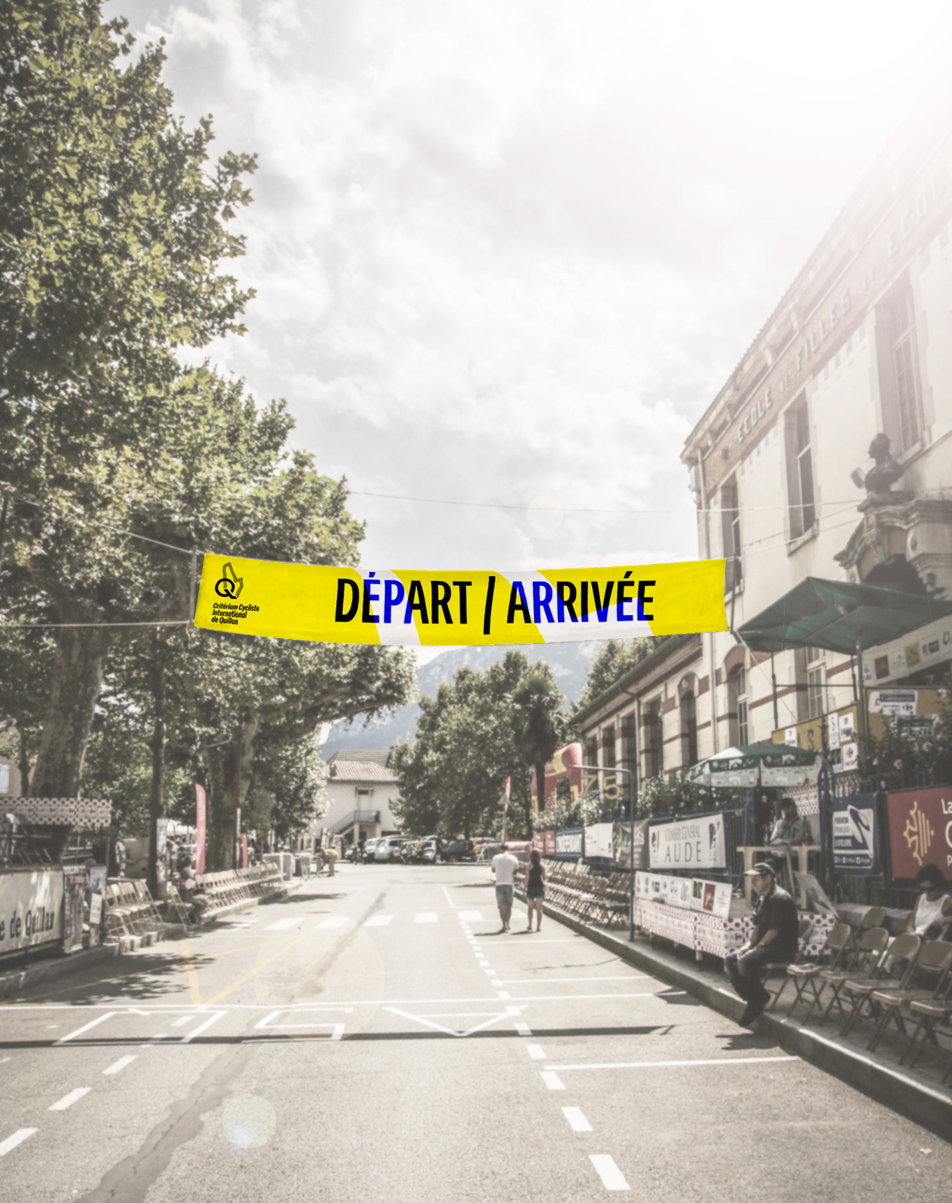
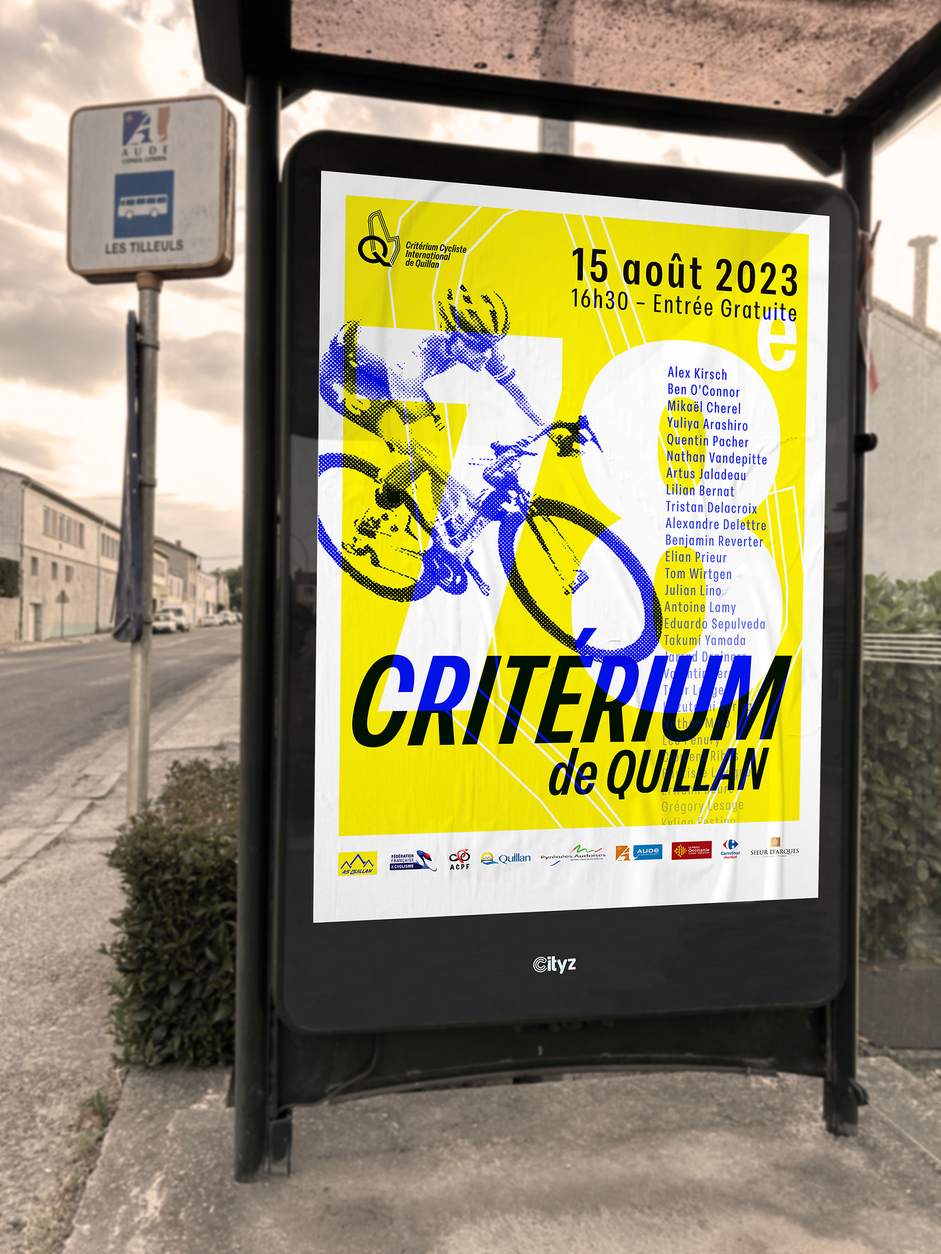
Above photo credit: MATOS VELO